courtnie.Exercise11

courtnie.Exercise114

courtnie.Exercise115

courtnie.Exercise116

courtnie.Exercise118

courtnie.Exercise119

courtnie.Exercise1110

courtnie.Exercise1111

For this project we had to create an invite set for the Cowgirl Museum. For this project I chose to use the logo as my focus. I incorporated the logo not only using the same colors but also taking off the spur and making it a flower. Personally, I really enjoy this project and found it informative based off card design and sizes.

exercise 10.courtnie limes

exercise 10.courtnie limes2

exercise 10.courtnie limes3

exercise 10.courtnie limes4

exercise 10.courtnie limes5

exercise 10.courtnie limes6

exercise 10.courtnie limes7

exercise 10.courtnie limes8

exercise 10.courtnie limes9

exercise 10.courtnie limes10

exercise 10.courtnie limes11

exercise 10.courtnie limes12

exercise 10.courtnie limes13

exercise 10.courtnie limes14

exercise 10.courtnie limes15

exercise 10.courtnie limes16

exercise 10.courtnie limes17

For this exercise, we focused on creating character style sheets and master pages in order to make our life a lot easier. One thing to remember when doing this, is when you are dealing with a master page you can not change its elements unless you unlink it by [Shift>Command]. By doing this, it allows you to change colors or text, but will keep the position the same.

Image

Exercise 9

Exercise 9

For this exercise the goal was to add the article to illustration we created in Illustrator. One of my main goals for this project was to figure out a way to make the image and text look as if they belong together. I decided to do this by taking a color from the image and incorporating it into the spread. Overall I find this to be a very successful spread and project as a whole.

Image

Lynda Chapter 6

Lynda Chapter 6

For this Lynda lesson, we learned all about importing graphics into InDesign. One of the main things to remember here i that under Object>object fitting you can find all the options for fitting the relationship between the frame and image. Also, these options are available in the top toolbar along with AUTO FIT…this will update an image after the frame change automatically based on the last fitting object. Another cool thing InDesign allows us to do is to edit an image, the way of doing this is seen in the blog image but it is Edit>Edit original or Edit with. Lastly, when links go missing or have issues, you can find the links toolbar next to the layers toolbar.

Image

Snowboard layout…CHARACTER STYLE

Snowboard layout...CHARACTER STYLE

For this exercise, we used InDesign to create a layout…one of the most important tools here is the Character Style…This feature allows you to change all the text or paragraph styles at once
1. Window>character/paragraph style
2. Three lines select new paragraph style
3. Select textboxes that you want this style

Image

Type in InDesign

Type in InDesign

For this Lynda exercise, we learned a ton about all the unique type editing features InDesign has. One of the most important buttons to remember editing type is the TYPE button on the top toolbar. Here, you are able to find almost everything you could possibly want…from editing the type box to insering characters. One really cool feature that this lesson covered is how to make your type box the size of your type. Although there are many ways to do this, the easiest is just by double clicking on the corner of the type box. This will then cause the type box to change size according to the text inside, this way, you can leave more space for other objects in InDesign. Another thing when dealing with type in InDesign to remember is that you can get spell check. To do this, you select EDIT on the top toolbar , and then select the spelling option. Again, InDesign provides many features for editing type and its appearance.

Image

Photoshop Slideshow

Photoshop Slideshow

This is an example of the slide show possibilities in Photoshop. One of the main things to remember about this is that in the end it needs to be saved [save for web> and make sure it is a Gif}. This will then allow you to open it by dragging it into your browser. Another thing to remember is how to get the slideshow option in Photoshop; we did this by going to [Window> Timeline]. In the end I feel as if this technique will be extremely useful when creating websites and other small animations.

Image

M&M

M&M

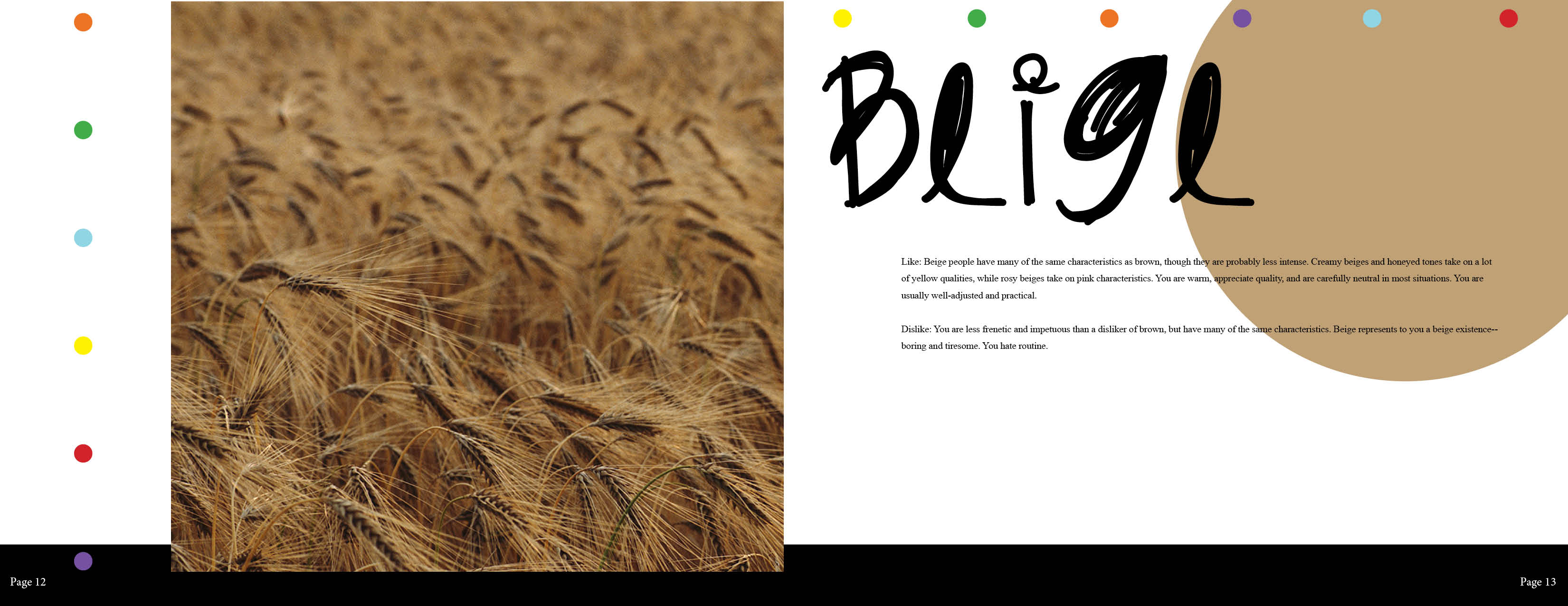
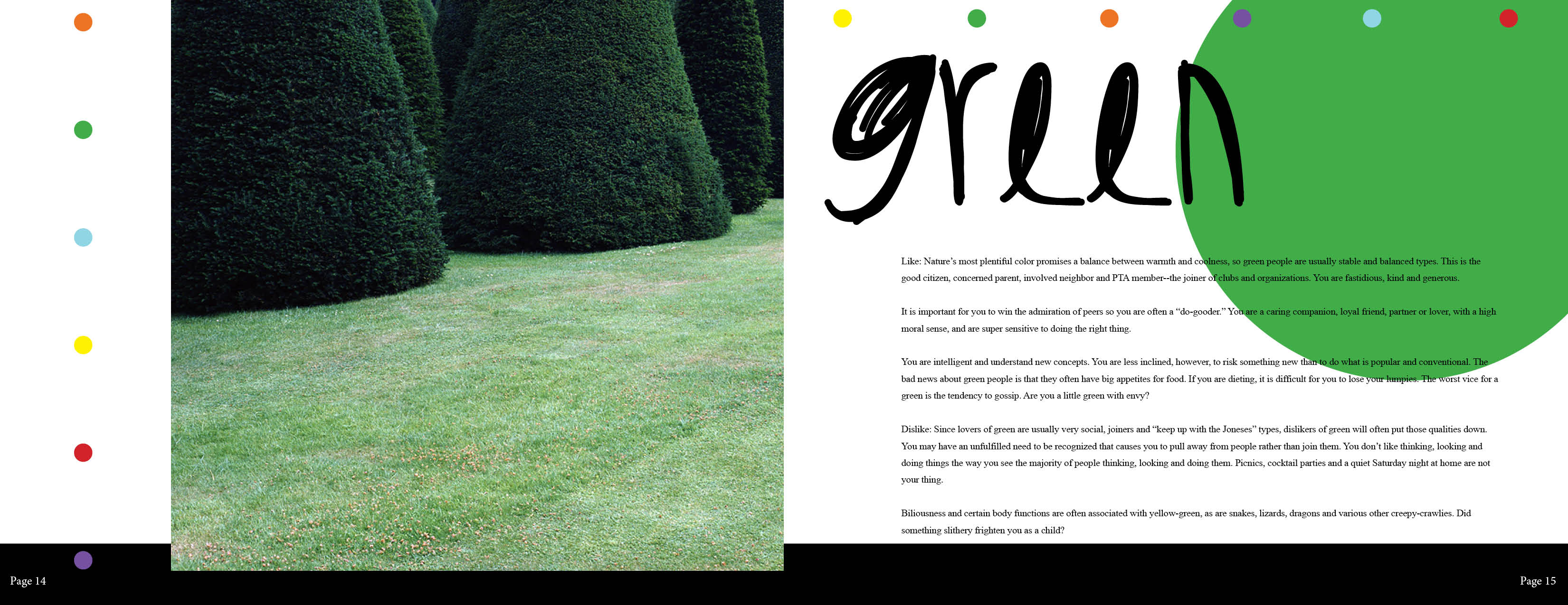
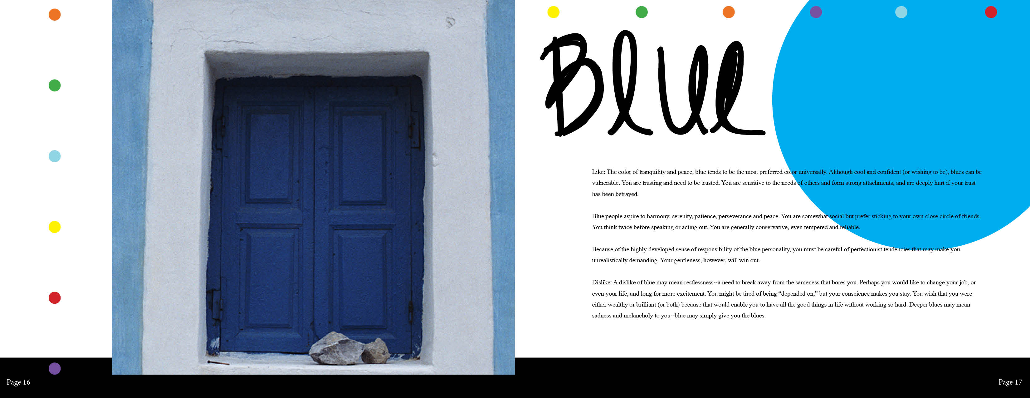
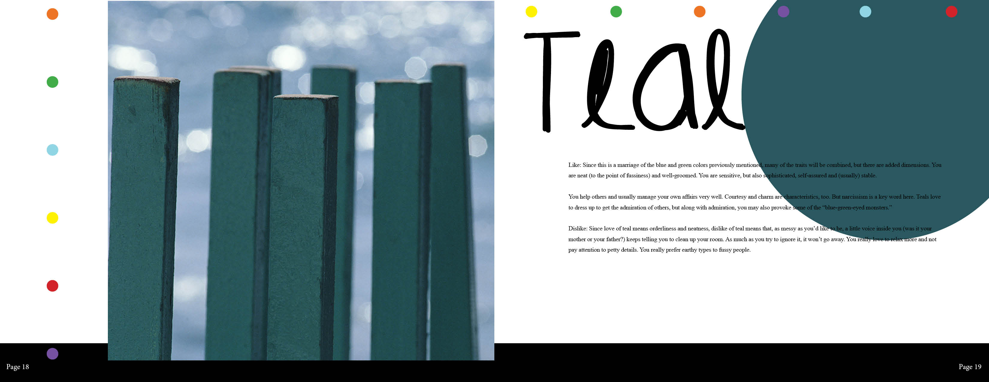
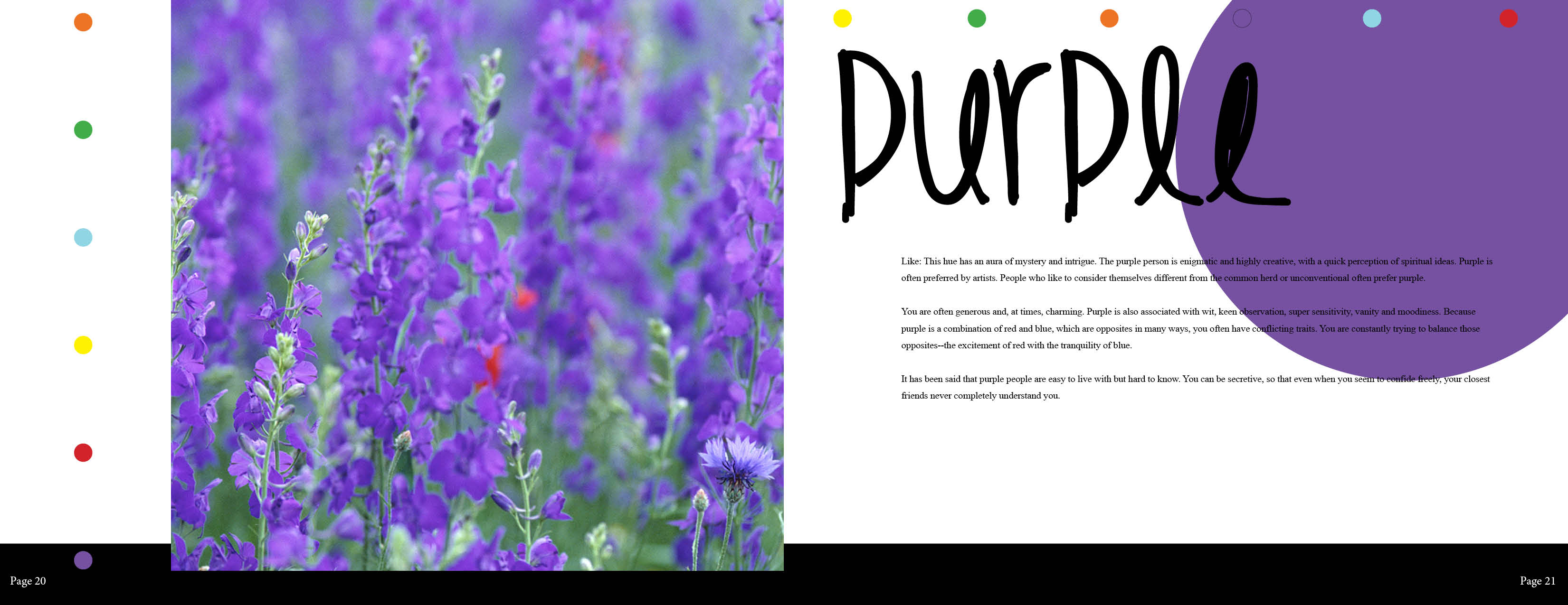
Although this is a very simple ad, I find the concept to not only be creative, but also very effective. In this case, the designer has managed to combine M&M’s with a very common object.

I have a feeling that the designer used Photoshop in order to create this ad. I have a feeling in order to get the M&M’s on the stoplight, the designer just used pictures of M&M’s placed on top of the stoplights, and then varying their opacity to make them look realistic. Also, I am not sure which one, but I have a feeling that the designer altered the layer effect on the green M&M, in order to make it look as if it is lit.

I feel as if the designers most effective design element is the simplicity and composition of this ad. By making the stoplight the centered and the star of the show, the viewer notices that before they do the words. I find this very effective because in this case if you notice the words first, they are not nearly as impacting.

Image

Save water…save life

Save water...save life

For this ad, the designer managed to illustrator a very current issue of the environment. I feel as if the designer did this in a very creative way that allows the viewer to understand the issue at hand.

For this ad, I have a feeling that the designer used Photoshop in order to make the plant look as if it is growing from the faucet. I have a feeling that the designer did this by placing both on different layers and then moving the soil/plant layer behind the faucet. One thing I also want to point out is the designer’s use of gradients in the background, which were most likely created using the gradient tool.

I find that the designers most effective design element in this ad is lighting. The lighting in the background manages to accentuate the plant and faucet at the same time. This allows the viewer to focus on these main aspects of this ad. Also, with this lighting, the design truly stands out and is overall visually appealing.